Redesigning Building Hope Project's Website to Increase Donor Engagement and Communicate Impact

TL;DR
Led an end-to-end redesign of the Building Hope Project website, starting with stakeholder interviews and content audits to understand where the existing experience failed to communicate impact or guide users to action. Synthesized insights into a clearer information architecture, user flows, and messaging hierarchy, then translated those decisions into low-to-high fidelity designs and a cohesive visual system in Framer. The result is a more intuitive, mission-driven experience that tells a clearer story, builds trust, and creates a stronger foundation for future testing and iteration.
2025
Web & Brand Designer
6 Months
Figma, Figjam, Photoshop, Framer
01
Building Hope Project, a nonprofit empowering youth through education in Uganda, needed a digital presence that matched its mission and impact. The existing site used outdated content and visuals, lacked a clear user journey, and did not guide visitors to take meaningful actions, such as donating or subscribing. As a result, the organization struggled to communicate credibility, connect emotionally with audiences, and grow its supporter base.
“Our old site felt static and outdated — it didn’t tell our story.”
— David Curtiss, Founder
02

Key improvements:
Impactful hero sections that immediately communicate mission and credibility.
Clear donation pathways with simplified user flows and prioritized actions.
Consistent brand system that reinforces trust through typography, imagery, and color.

03
My objectives for this project were to:
Establish a professional, cohesive brand identity that conveyed trust and impact.
Increase donations and newsletter sign-ups by clarifying calls-to-action and user journeys.
Improve usability by simplifying navigation, content structure, and readability.
Build a consistent visual system that could scale across digital touchpoints (web, email, social).
Build Credibility
Improve Storytelling
Increase Donations
Enhance Usability
04
To ground the redesign in real needs, I started with stakeholder interviews, a consultation questionnaire, and a UX audit. These revealed issues with outdated content, unclear storytelling, and poor visual hierarchy. I then conducted user-focused research to understand donor motivations, emotional triggers, and barriers to engagement.

From this research, I took three core design actions:
Redesigned site architecture — Created a clearer navigation and funnel to guide users toward meaningful actions like Donate and Get Involved.
Rebranded visual identity — Updated logo, colors, and typography to reflect trust, optimism, and impact.
Improved accessibility and usability — Enhanced readability, responsive layouts, and page performance.
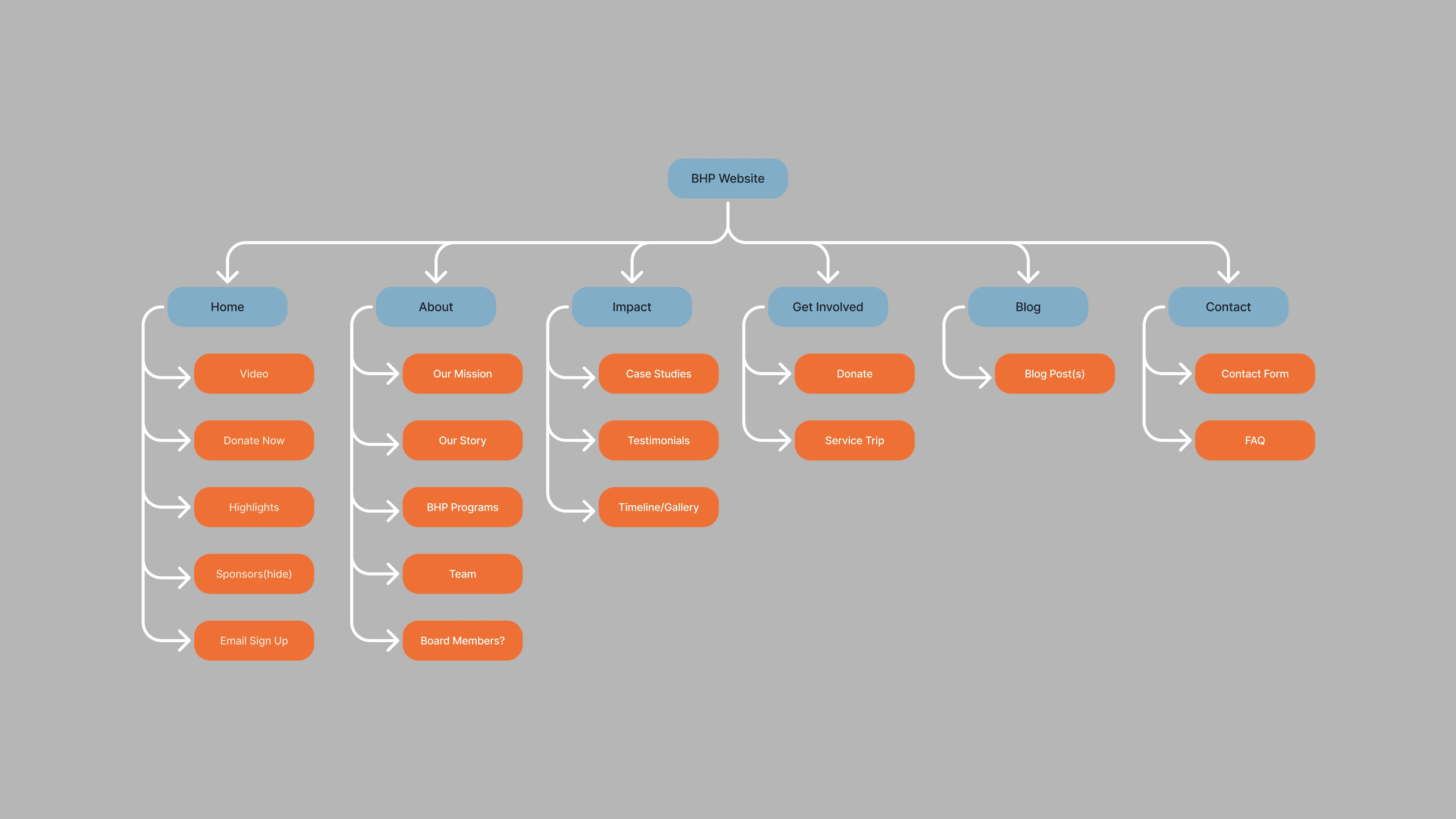
Sitemap
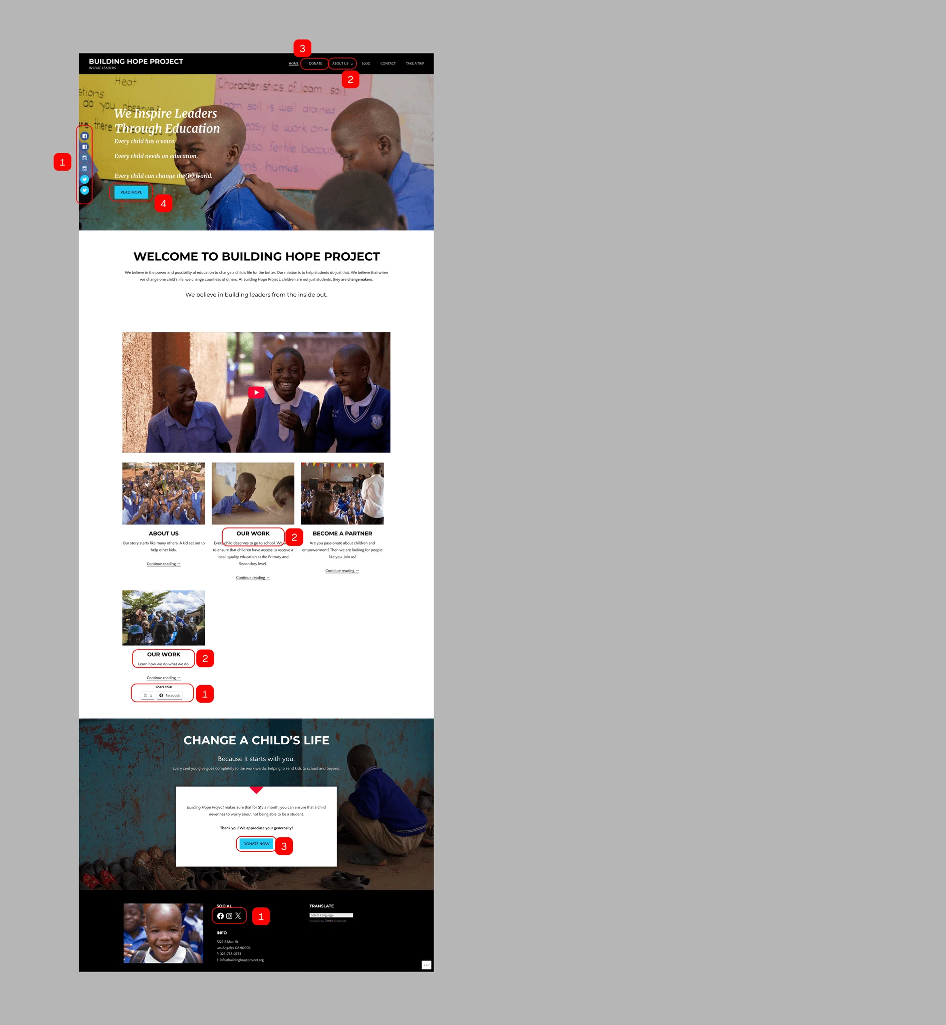
In the rebranding process, I aimed to retain some key elements while making a bolder statement to better reflect trust, hope, and vibrancy.

BEFORE

AFTER
05
Design → Metric → Outcome
Rebrand identity → More professional and hopeful visuals → Higher donor trust and engagement.
Simplified navigation & CTAs → Easier paths to action → Improved donation and subscription conversion.
Clear content & accessibility → Stronger storytelling → Better connection with mission and partners.

06
What Worked
A cohesive rebrand and improved architecture elevated the site’s credibility and better reflected the organization’s mission.
Storytelling tied to user motivations strengthened emotional engagement and aligned online presence with stakeholder expectations.
Opportunities for Growth
The launch included limited usability testing — expanded research post-launch will validate flows and uncover refinements.
Business meaning
A clear, credible digital presence strengthens the Building Hope Project’s ability to raise funds, attract partners, and position itself as a serious NGO within the education and youth development space.